


How to Frame a Canvas with Pop-up Frames
By Felix Trash
Framing a canvas doesn’t need to be expensive or complicated. In this step-by-step guide, we’ll show you how to frame a stretched canvas using Pop-up Frames.
Read more📦 Free delivery on £30+ orders

We started Pop-up Frames because, as graphic designers, we were frustrated that so much art was never making it onto the wall. So when the Design Museum got in touch to ask if we could help them buildout the final part of their Wes Anderson exhibit, we were ecstatic.
Wes Anderson's films are known for showcasing worlds that are meticulously built — through colour, composition, and detail he creates an instantly recognisable aesthetic. Contributing — even in a small way — to how one of our generation's most iconic visual world-builders was incredibly exciting; and a little daunting.
After you journey through the 'Wes Anderson: The Archives' exhibition, you end up in the exhibition shop. Here you can find a wide range of memorabilia — including iconic film posters, art prints, postcards, and gift-cards. Because Wes Anderson's work is eclectic and prolific, we had a number of different dimensions and orientations to frame:
Everything needed to sit together as a cohesive whole, rather than feeling like a collection of individual items. And all of it had to work within the constraints of a Grade II listed building, where traditional fixing methods simply weren’t an option.
Final dimensions weren't locked. Layouts had to shift. We couldn't drill into any of the walls. Put another way, we needed a flexible framing solution that wasn't pre-planned and could adapt in real time.
We arrived with a small selection of Small, Medium and Poster Pop-up Frames (cut-to-size picture frames with adhesive wall mounts), not knowing exactly what would be framed where. Over the course of a single afternoon, frames were cut to size, artworks swapped in and out, and the display reshaped as the shop took form around us.
With Wes Anderson, colour is never incidental. His films are defined by carefully tuned palettes that shape mood and character as much as story does.
That meant framing couldn’t be neutral or generic. Each poster and print was paired with a complementary Pop-up Frame colour, chosen to echo the artwork without competing with it. Our new palette from Italian papermakers — soft pastels and muted tones — helped the wall read as one considered visual composition, rather than a set of individual products.
Since opening, Wes Anderson: The Archives has been widely praised for its attention to detail and celebration of the craft behind Anderson’s films — from sets and graphics to objects and design thinking. That same care carries through into the exhibition shop, where the posters and prints feel less like merchandise and more like extensions of the show itself.
For us, it was a reminder of why picture frames matter. When they’re done well, they don’t shout. They quietly support the work, letting great design speak for itself.
If you visit Wes Anderson: The Archives, we'd love to know what you think!


By Felix Trash
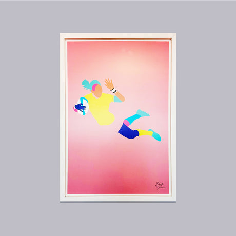
Framing a canvas doesn’t need to be expensive or complicated. In this step-by-step guide, we’ll show you how to frame a stretched canvas using Pop-up Frames.
Read more
By Felix Trash
Framing your walls shouldn’t risk your deposit. This guide shows renters how to hang pictures without nails, damage, or hassle — and finally get their walls working.
Read more
By Felix Trash
How Pop-up Frames helped bring one of cinema’s most distinctive visual worlds into people’s homes. It started with an email We started Pop-up Frames because, as graphic designers, we were...
Read more
By Felix Trash
At Pop-up Frames, we’re on a mission to make framing easier and more sustainable — so it’s simpler to fill your walls with the things you love. 2025 was a...
Read more
By Felix Trash
Shop sustainable Black Friday picture frames at Pop-up Frames. Enjoy limited offers on our peel & stick, eco-friendly frames — no nails, no damage, just beautiful design made easy.
Read more
By Felix Trash
Discover picture frames you can stick on the wall without nails or damage. Pop-up Frames come with peel & stick wall mounts — easy to apply, easy to reposition.
Read more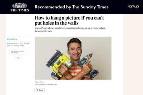
By Felix Trash
In an article on renter-friendly ways to hang pictures, The Sunday Times highlights how to add personality without risking your deposit. Their first recommendation? Pop-up Frames.
Read more
By Felix Trash
Not sure what size frame you need? This UK size guide covers A4, A3, photo and poster dimensions with exact measurements in centimetres and inches, plus recommendations for the right...
Read more
